Skip to content
Marketing18 minJuly 2, 2026

Corporate identity for business in Uzbekistan — a full guide for owners

Robert MirovUpdated Jul 2, 2026

Corporate identity for business in Uzbekistan — a full guide for owners

This article is for business owners in Tashkent and across Uzbekistan who already run ads, Instagram, or a website — but the company looks different in every channel. One green in Stories, another on the site, a third logo version on the PDF invoice: customers do not always connect them as one firm. There are no promises that “ads will get twice cheaper,” and no pressure that “without a thick brand book you are nobody.” There is a calm, practical breakdown: what corporate identity means in plain words, how it differs from visual identity and branding, what the package includes, what minimum usually works for SMEs, where the style should show up, how to handle Russian / Uzbek / English, soft cost guides, and how to start in 7–14 days. UZNEO keeps the tone simple: facts, a clear work order, and honest limits — no hype and no “magic” numbers in creatives.

01What corporate identity is — in plain words

Logo

Logo

Brand colors

Colors

Typography

Typography

Brand book

Brand book

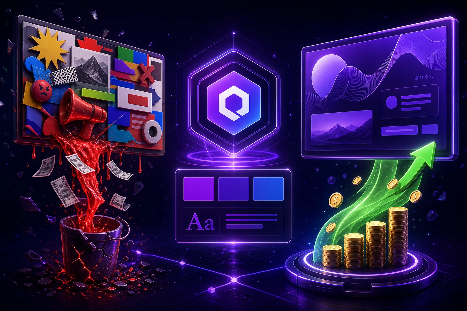
Corporate identity is a set of rules people use to recognize you: logo, colors, fonts, carrier templates, and a short tone of voice. It is not “one pretty image once,” but a working package that a designer, SMM manager, print shop, and the person sending invoices can follow. Don’t mix neighboring terms — they sound similar on first use, but answer different questions: • Visual identity (айдентика) — mostly visual: mark, color, type, how it looks. • Branding is broader: positioning, the promise to the customer, service experience, reputation. • Corporate identity is the practical bridge: what you can hand a vendor as files plus a short guide. • Brand book — the rules document; it can be a 3–8 page mini-guide or a 30+ page volume. If the logo is the same but Instagram and the website use different colors, customers often fail to connect them as one company. For a local business, a clear minimum that works on Instagram and your website or landing page is enough.
Without a unified styleWith a working minimum
Every post is “whatever happened”Templates + palette, faster shipping
Three shades of “almost our” greenOne HEX for screen, one CMYK for print
Vendor keeps asking “which logo?”One SVG / PNG / PDF archive
Ads and site contradict each otherAd → site path looks like one firm
Corporate identity does not replace the offer, price, or service. It helps keep recognition intact while you sell.

02Why business needs it — without miracle promises

The main benefit is recognition and less chaos in day-to-day work. When someone sees an ad, then the profile, then the site and a WhatsApp / Telegram message, it is easier to understand that this is the same company. Without a unified style, each touch looks like a “new” firm — especially in niches where competitors offer similar services. What usually changes in practice (process, not magic): • Creatives and posts ship faster — you have templates and a palette. • Vendors argue less about “which green is correct.” • Ads and offline materials stop contradicting each other. • A familiar look is easier to trust than a random set of Canva images. • Changing SMM or designers costs less: rules are already written down. This is not a guarantee of a cheaper lead (CPL — cost per lead). It is a way to stop paying again and again for a “first introduction” when the brand looks different every time. If you also run Google Ads, a consistent visual helps keep the path from ad to landing page intact.
BeforeAfter locking the style
Stories one color, site anotherOne palette on every screen
Logo as a JPG from TelegramSVG + PNG + mono in one archive
Every vendor “slightly improves” itMini-guide: do / don’t
New signage “as we liked it”Same colors and font as online
Honest caveat: a nice style with a weak offer and slow chat replies will not save sales. Fix service and a clear proposition first — style amplifies what already works.

03Uzbekistan specifics: languages, alphabets, channels

In Uzbekistan, corporate identity is almost always multilingual — even if you are “Russian-only for now.” The company name, address, menu, and “leave a request” button may need Russian, Uzbek (Latin), and sometimes English. A font that looks great in Latin often breaks Cyrillic or the letters oʻ, gʻ, ʼ. Check before you pay the designer: • Type the full company name in Russian, Uzbek, and English in the chosen font. • Check the address and a short slogan — rare letters usually break there first. • Confirm the font license allows website and ads use, not “preview only.” • Put rules for two–three language template versions into the guide (at least spacing and line length). Channels where local businesses “live” the style: Instagram and Telegram (often the main traffic), website or landing page, Google Ads / banners, signage and in-hall navigation, letterheads and PDF invoices, sometimes packaging or field-service uniforms. 2GIS and map cards also read as part of the brand: avatar and cover should match the rest. Do not copy the palette “like the niche leader in Tashkent” — the market is small, and customers notice clones. A simpler mark and your own accent beat someone else’s gradient “because everyone does it.” If you are also building online sales, a unified visual is one trust layer in the chain — not a separate “project for beauty.”

04Package contents: what each block includes

Logo

Logo

Colors

Colors

Fonts

Fonts

Brand book

Brand book

Below is what usually sits inside a solid package. It makes it clearer what you pay for — and what is missing if you only received a “logo image” from chat. Logo • Primary version (horizontal / mark + name). • Simplified icon for avatar, favicon, and small sizes. • Monochrome: black and white on a dark background. • Clear space and the minimum size where the logo still reads. • Source files: SVG / PDF / PNG with transparency — not only a JPG from a messenger. • A short ban list: no squashing, no rainbow recolors, no foreign outlines. Colors • Two or three main colors + one accent for buttons and CTAs (call to action). • Screen codes (HEX / RGB) and print codes (CMYK) if you print signage or letterheads. • A short rule: where primary, where background, where accent — so you do not paint everything. • Neutrals (gray / white / dark) for text and backgrounds — lock those too. Fonts • One for headlines, one for body — or one family with two weights. • Check Cyrillic, Latin, and Uzbek characters before you pay. • License: usable on the website and in ads. • A system fallback if the web font fails to load. Templates • Instagram post and Stories (and a Telegram / VK cover if needed). • Social cover and favicon. • A simple business-card or invoice/proposal PDF layout. • If needed — a draft Ads banner (without “magic” numbers in the creative). • One “reference” site or landing header so the web designer is not guessing. Brand book (or mini-guide) • Everything above + “do / don’t” examples. • Photo rules and a short tone for copy (calm / friendly / formal — one paragraph). • Sample carriers: website, ads, letterhead, signage. A multi-page mini-guide already closes most disputes. A thick brand book adds depth when many people execute the brand.

05SME minimum vs full brand book

SMEs do not need a thick document on day one. They need a working minimum. A brand book starts to make sense when branches, a franchise, several vendors, or frequent partner decks appear.
ItemMinimum (SME)Full brand book
LogoPrimary + icon + mono+ variants, clear space, distortion bans
Colors2–3 colors with HEXFull palette + CMYK + combination rules
Fonts1–2 families, alphabet checksHierarchy, fallbacks, licenses
TemplatesPost, Stories, favicon, invoice/proposalBusiness card, letterhead, deck, signage, packaging
Document3–8 page mini-guideOften 15–40+ pages with examples
Best forSolo, one location, 1–2 vendorsChain, franchise, design + SMM + print split
Timeline guide7–14 days3–6 weeks with normal feedback
Budget guideLower (see pricing section)Noticeably higher due to carriers and depth
Who usually fits the minimum: one Instagram, a site or landing page, PDF invoices, one sign, one or two vendors. Who more often needs a full brand book: several branches, partners in other cities, frequent proposals and decks, different people for design, ads, and print, a franchise or multi-location network. If you order a website and ads at the same time, even a short guide already cuts rework. Do not buy a “thick brand book for status” if only two people execute the brand and you approve every post yourself.

06Where it applies: touchpoints checklist

Advertising

Advertising

A touchpoint is any place a customer meets your brand. Customers rarely buy on the first touch. They move through a chain: ads → profile → site → chat → invoice → offline. If the middle looks like “another company,” trust drops even when the offer is fine. Carrier checklist (tick what you have):Website / landing — header, buttons, favicon, social cover. See also common website mistakes. • Google Ads / banners — same colors and logo as the landing page; no foreign palette “just for a test.” • Instagram — avatar, highlights, post and Stories templates. • Telegram / WhatsApp — channel or Business profile avatar and a calm reply tone. • Signage and in-hall navigation — same colors and font as online; street readability beats fine ornament. • Letterheads, invoices, proposals — logo and accent in the PDF, one footer style. • Packaging / stickers / uniforms — at least the primary color and mark if you have offline product or field service. • Map cards / 2GIS — avatar and storefront photos in the same palette. A short evening audit: open everything on your phone, take screenshots, and put them side by side. Where colors and logo drifted — fix there first. You do not need to fix everything overnight: start with avatars, the site header, and a Stories template — the most frequent touches. A unified visual does not replace the offer or the service. It helps keep recognition intact while you run online sales.

07Soft cost and timeline guides in Uzbekistan

The figures below are a soft market guide for Tashkent and larger UZ cities — not a UZNEO price list or a contract. The outcome depends on deliverables, revision rounds, number of languages, and whether photo style or print is in the package. By scope:Working minimum (logo + palette + fonts + a few templates + short guide) — often roughly 3–10 million UZS (order of $250–800). • Expanded package (minimum + business card, signage layout, first Ads/Instagram creatives) — more often 8–20 million UZS (order of $650–1,600). • Full brand book with carriers and detailed rules — noticeably above the minimum, often from 15–40+ million UZS (order of $1,200–3,000+) when there are many layouts and languages. Cheaper can mean a template without proper sources — rework later costs more. Higher usually means print, photo style, and multi-language guides in the same package. By timeline: • Minimum with normal feedback — 7–14 days. • Full brand book — more often 3–6 weeks. • Client approval pauses usually stretch the timeline more than the drawing itself.
What you bought “cheap”How it usually ends
One JPG from chatA full redraw within a month
Logo without SVG or monoPain on signage and favicon
Palette “by eye,” no HEXThree greens across three vendors
No mini-guideEvery new SMM “restarts” the style
A too-small budget often buys one JPG without SVG or rules — a month later you pay again for a “new style.” Put sources and a short guide into the same estimate.

08Step-by-step start in 7–14 days

The order is simple. You do not need to start with a “pretty logo in a vacuum” — start with a brief and a carrier list. Days 1–2 — brief • What you sell, to whom, how you differ from neighbors in the niche. • Where touches already exist: site, Instagram, Ads, signage, letterheads. • Constraints: languages, budget, deadline, what cannot change (old name, a color “already on the sign”). • 3–5 references for “liked atmosphere” and 3 for “we don’t want this” — without copying other logos. Days 3–4 — orientation • A short look at competitors: which colors and tricks repeat — better avoid them. • Moodboard: mood and atmosphere, not someone else’s logos. Days 5–8 — concepts • Two or three logo options, not ten. • Palette and fonts, small-size test (avatar, favicon). • Check Cyrillic, Latin, and Uzbek characters. Days 9–11 — carriers • Test layouts: post, Stories, site or landing header, invoice/proposal. • If needed — a draft Ads banner and a signage sketch. Days 12–14 — lock-in • Mini-guide: colors, fonts, do/don’t, links to sources. • Hand off files to vendors as one package (cloud folder + a short “what lives where” list). First decide whether you need a landing page or a full website — that shapes the deliverables. It is often easier to do identity and website development in one cycle so you do not redo work twice.

09How to accept the work: handover checklist

Many disputes start not at “which logo is prettier,” but at handover: files are scattered, rules are missing, the font has no license. Before final payment, walk this list. Required minimum in the archive: • Logo: SVG + PNG (transparent) + mono; icon for avatar. • Palette: HEX (and CMYK if you will print). • Font names + license link / file. • 2–4 carrier templates in editable form (Figma / AI / Canva — as agreed) plus PDF/PNG export. • Mini-guide PDF of a few pages. • One “for vendors” page: what can change without approval, and what cannot. Phone check (10 minutes): • Avatar reads at Instagram size. • Favicon is recognizable in a browser tab. • Accent button neither screams across the screen nor disappears on white. • The name in Uzbek / Russian does not clip in the Stories template. If something on the list is missing, that is not nitpicking — it is a risk of paying again in a month. Calmly lock the fix into the same contract, not “sometime later.”

10Common mistakes — and a better way

Below are typical traps for owners in Uzbekistan and a calm alternative. Comparisons are in a table so you can match them to your current state.
Before (mistake)After (better)
“Make it like the neighbor” — niche-leader cloneYour own accent: another color pair or a simpler mark
Complex logo with ornament and gradientMark readable in one color at icon size
Five+ colors “for every case”Two main + one accent; rest is photo and neutrals
Lovely Latin font without ў / CyrillicType the name in RU / UZ / EN before payment
No short rules3–8 page mini-guide
Logo from one, site from another, Ads from a third — no shared packageOne archive: SVG + HEX + 2–3 reference layouts
Bought only a JPG from chatSVG / PDF / PNG + mono in the contract
Short meaning list: 1. Neighbor clone — recognition is built on difference, not on a copy. 2. Overcomplicated logo — keep detail for the large version, not the required minimum. 3. Too many colors — a new palette every post kills recognition faster than “boring” discipline. 4. Fonts without alphabets — a frequent and expensive mistake in Uzbekistan. 5. No guide — a month later a new vendor “reinvents” the brand; a mini-guide is cheaper than rebuilding the website and all creatives. 6. Split vendors without a package — three “almost your” greens and three logo versions. A quiet mistake is saving on sources. Without SVG, every edit becomes a redraw from scratch.

Summary

Corporate identity is not a luxury for big brands and not a mandatory “thick brand book on day one.” It is a way to look like one company in every channel and argue less with vendors. Start with the minimum: logo, colors, fonts, templates, and a short guide. Account for Uzbekistan’s languages and alphabets. Walk the touchpoints checklist and a calm 7–14 day sprint. Add a full brand book when branches or multiple contractors appear. Accept work against a handover checklist — sources and rules matter more than a pretty screenshot. If you want end-to-end help — UZNEO calmly builds identity together with a website and, if needed, promotion. You can begin with a short conversation on the start page.

Need a website that brings leads?

Describe your task on Telegram — estimate and timeline in 24h, locked before start.